


They say a picture says a thousand words, so here are six. Well, they are charts and not really pictures, but this is economics.
Also read: Recession Watch: Tick Tock, Tick Tock
Also read: Three Lessons From the 70s’ Great Inflation
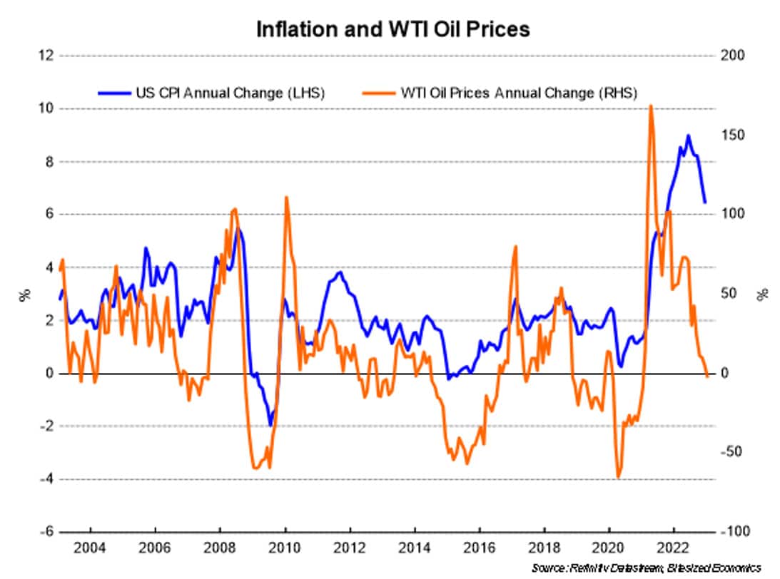
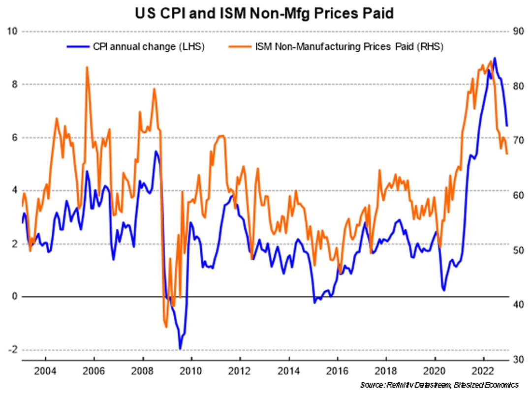
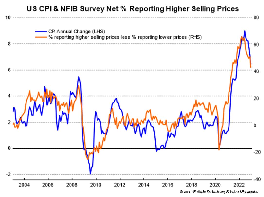
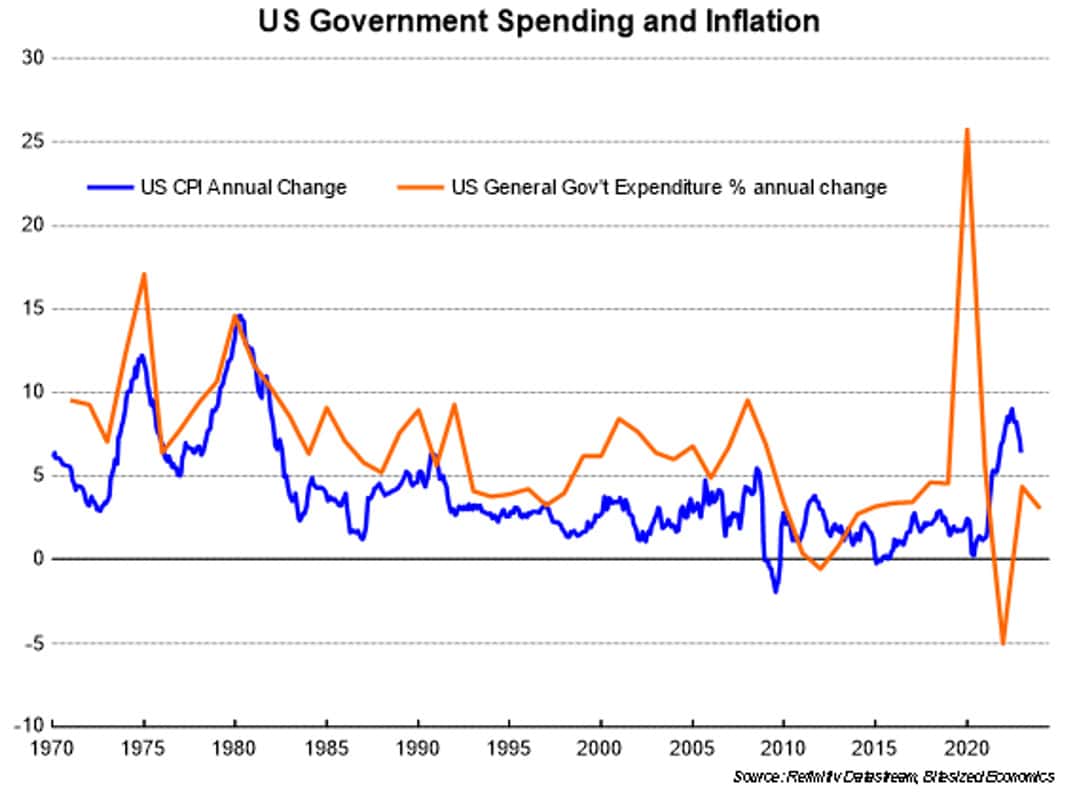
All signals have been and continue to point to US inflation easing, and could come down pretty rapidly this year. Recent data have only confirmed this trend.
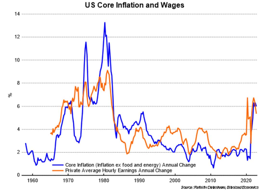
The only chart from this collection which doesn’t suggest easing inflation is the relationship between core inflation and wages, and probably has bigger implications for the longer-term outlook for inflation.
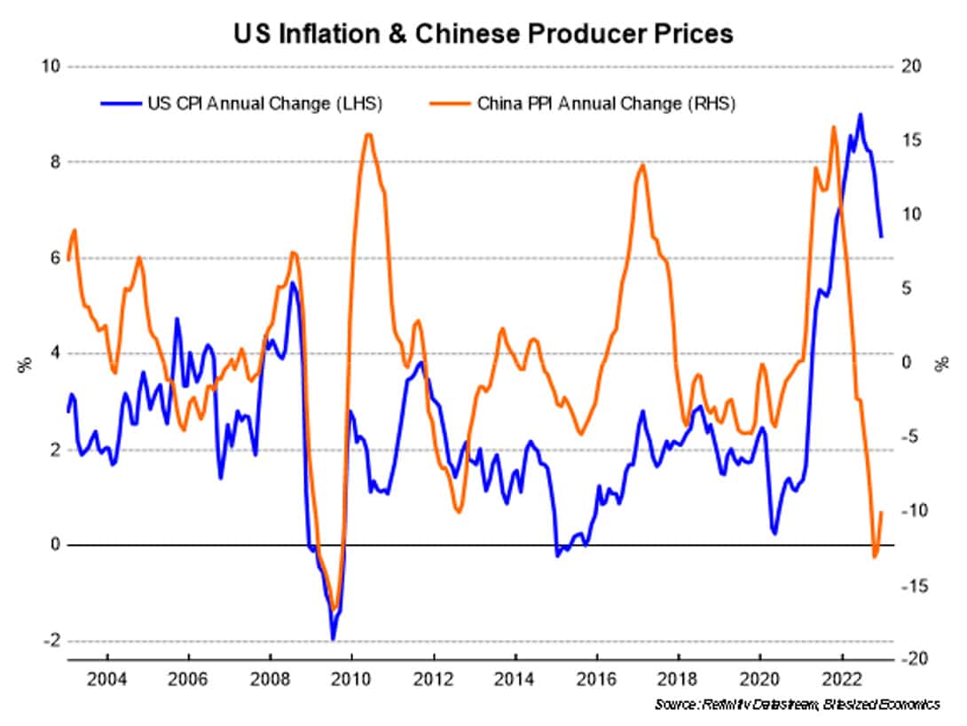
Concerns have recently arisen that China’s re-opening will be inflationary and boost commodity prices. That will depend on how much China’s pickup in growth can lead demand globally, but it might also just end up offsetting weaker demand in other parts of the world – in particular, Europe.
Nonetheless, we should be prepared for inflation easing pretty significantly this year, that is faster and lower than what is expected, and there is a risk it could ease even below the 2% that the US Federal Reserve is targeting.
This article first appeared here.


")


 Platform To Digitally Trade Corporate Bonds")


